Themes
Salt theme is a collection of defined visual styles that shape the overall look-and-feel of a digital product. This encompasses elements like color, typography, spacing, and corner radius, ensuring a consistent and cohesive appearance throughout the product.
A theme in Salt enables delivery teams to streamline the process of creating a consistent design language across their business domain, platforms or products.
Salt themes are defined by design tokens that are organized into 3 groups. Each group of tokens has a specific purpose:
- Characteristics: Semantically grouped tokens that are used to style components.
- Palette: Consolidated view of values used in Characteristic tokens – the simplest entry point to modify the theme.
- Foundations: Ramps of tokens for the raw values that underpin the design system.
Example: Status Characteristic Token in Toast component
Toast use status tokens to denote status with color, such as green for success.
- Characteristic Token:
--salt-status-success-foreground-decorative - Palette Token:
--salt-palette-success-foreground - Foundation Token:
--salt-color-green-400(default:rgb(48, 156, 90))
To keep tokens manageable, Salt doesn't create tokens for every style attribute of a component. Instead, Salt provides tokens that reflect component design decisions. This means we can maintain the quality of interaction design patterns and accessibility.
As of Q3 2024, Salt offers two themes: the current theme, that reflects the UI Toolkit (UITK) design language, and the new J.P. Morgan (JPM) brand-endorsed Salt Next theme.
In Salt's architecture, theme styles (known as design tokens) are kept separate from components. Regardless of the chosen theme (the look-and-feel), the underlying components remain the same. This separation makes it easy to switch between themes, without breaking or altering the underlying application build.
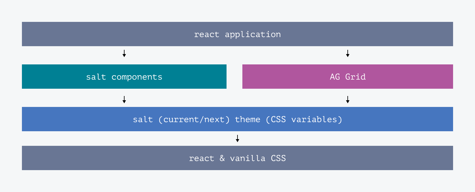
Salt Next is a new theme for Salt which is built on new design foundations endorsed by the J.P. Morgan Corporate Brand team. It is a non-breaking update to the Salt library which officially brings 'styling options' and 'theming' capability to Salt components.
Salt design system does not recommend customizing the look-and-feel of the current Salt theme.
There are two ways to customize the look-and-feel of components:
- System-wide 'styling options': Choose from a selection of predefined design choices.
- Theming: Change the value of supported design tokens.
Styling options make it easy to adjust the design of Salt components across the system for a user group or use case:
Relates to the amount of content that can fit on a screen based on the size and spacing of components. The four densities are high, medium, low, and touch.

Determines the dominant color – blue (aligned to the current theme) or teal (aligned to the Salt Next theme inline with the JP Morgan MasterBrand Styleguide) for light or dark mode.

Sets predefined corners in certain components to sharp or round.

Displays heading and/or action fonts as Amplitude or Open Sans.

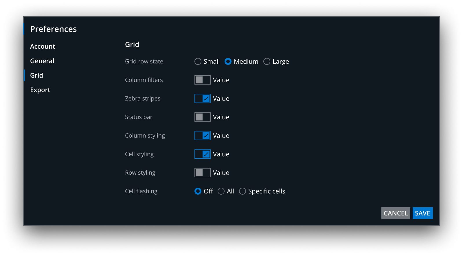
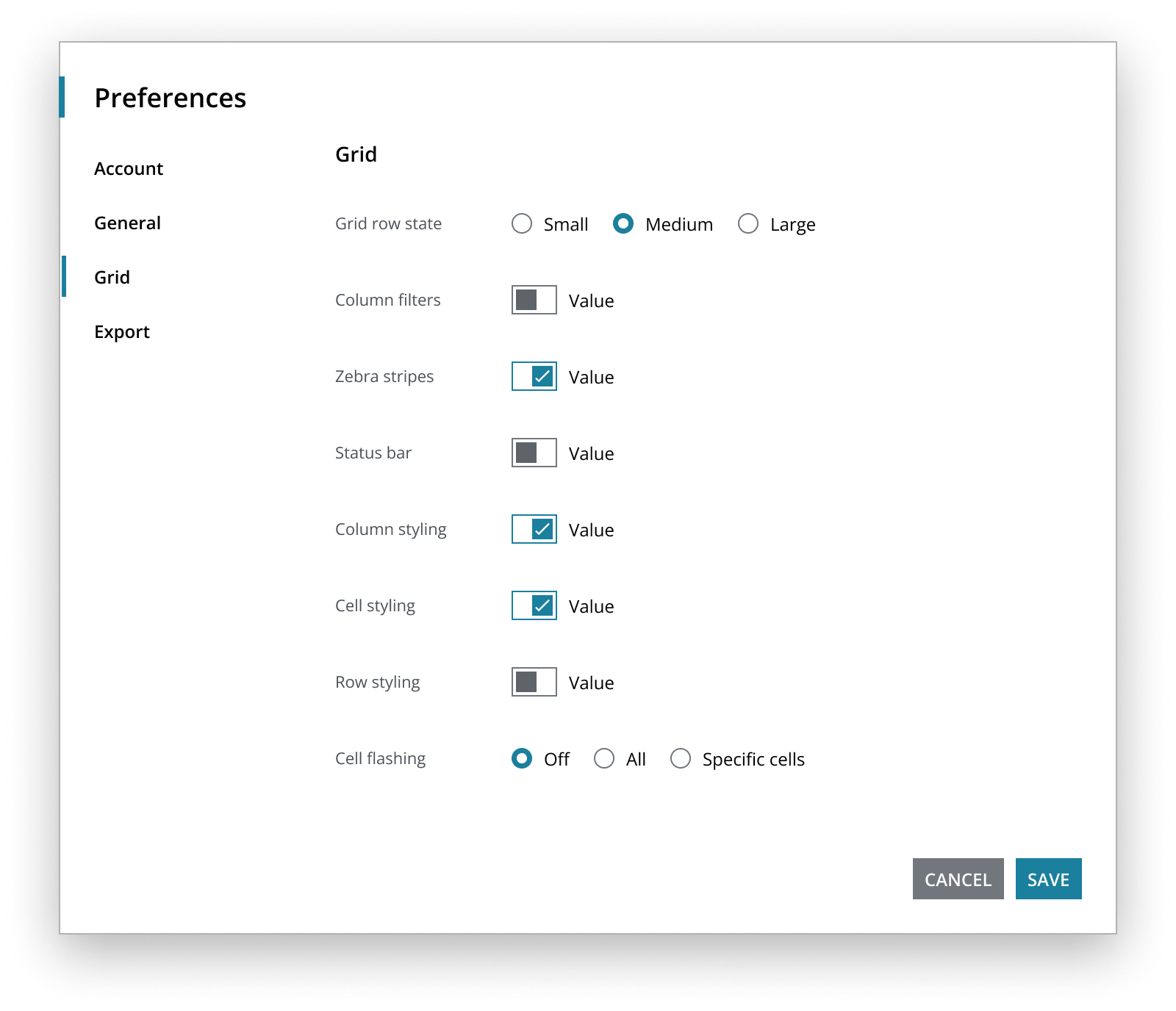
Styling options can be combined as a 'theme recipe' to create design languages which are optimized for a specific context, for example:
Example #1: An external application is infrequently for limited data input An LOB define their design language to be low density, light mode, round corners, amplitude font, teal accent.
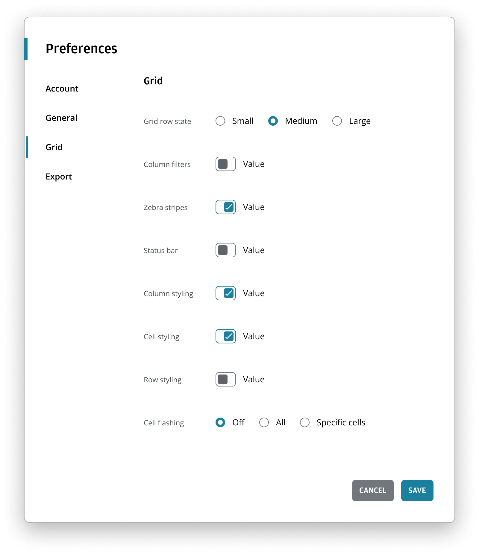
Example #2: An established internal application is frequently to handling vast amounts of data. An LOB define their design language to be high density, dark mode, sharpcorners, open sans font, blue accent.
Example #3: An internal application is frequently to handle operational tasks. An LOB define their design language to be medium density, light mode, sharp corners, open sans font, teal accent.
There are several benefits to using styling options:
- Allows easy modifications within predefined parameters.
- Ensures a consistent look-and-feel across LOBs, products, or user groups.
- Design languages can be easily updated as new styling options are released.
Individual products within the LOB can customize their LOB design languages further if needed.
If styling options alone don't achieve your desired visual design, you can create a new theme by changing the values of foundational, palette, or characteristic design tokens. This requires a deep understanding of the system, and significant design effort and increased cost. Possible use-cases for theming include:
- Differentiating products while maintaining alignment with J.P. Morgan, e.g. unique accent bar colors for each product in a platform.
- Aligning with an alternate design system to support migration to Salt.
- Achieving greater parity with a brand other than J.P. Morgan, such as Chase.
For example, you may choose to use a custom primary color in your app. Here the blue is replaced by a custom magenta (and checked to ensure 4.5:1 color contrast).

Any theme changes outside of 'styling options' mean you assume certain responsibilities from Salt. For example, if you change a token for a background color, you must ensure it meets accessibility standards for contrast ratios.
Most design tokens are used across multiple components, so you need to understand the impact and test changes thoroughly across the product. In Figma, create and publish custom components independently of the provided Salt libraries. In code, create a centralized CSS stylesheet with the changes to be imported alongside the Salt theme.
By modifying the theme, you own the cost of the change and are responsible for maintaining it.
White labelling allows the design system to be fully customized. It means you can take the base code and make it look completely different. It enables external companies to follow their own brand guidelines or mimic an alternate design system as closely as possible without having to build a design system from scratch.
In code, each component would need to be wrapped and published as a new component, and from a design perspective a new set of libraries would need to be created and maintained.
White labelling requires significant changes and investment, and therefore is not supported by the Salt team.
In addition to the Salt Next theme, Salt is beginning to provide further component-level styling options for full borders (where the border is considered decorative) and drop shadows. The options are on a component-by-component basis and not a system-wide styling option. You can choose whether to have these options on each part of the application.
Optional border support is already being rolled out across Salt's form control components (i.e., Input, Multiline, Combo Box). This feature can be combined with 'Corner' and 'Accent' styling option to provide the capability of Form Fields with full borders and rounded corners (a long request feature), aligned to brand.

Salt Next brings the JPM brand identity to CIB (Commercial & Investment Bank) digital applications.
Working with Corporate Brand and CIB Marketing, the Salt design system has adopted key styles to ensure visual alignment to the JPM brand with the Salt Next theme. Although not an exact match, these changes have been approved by both parties to address the complexities of desktop and web applications across the CIB.
The Salt Next foundational color palette has been refreshed with updated shades of the same general colors found in Salt and UITK (gray, blue, teal, purple, red, orange, and green). These new colors are derived from the hue and saturation values in the JPM MasterBrand Styleguide. The updated palette creates a lighter and brighter look suitable for both institutional and consumer experiences.
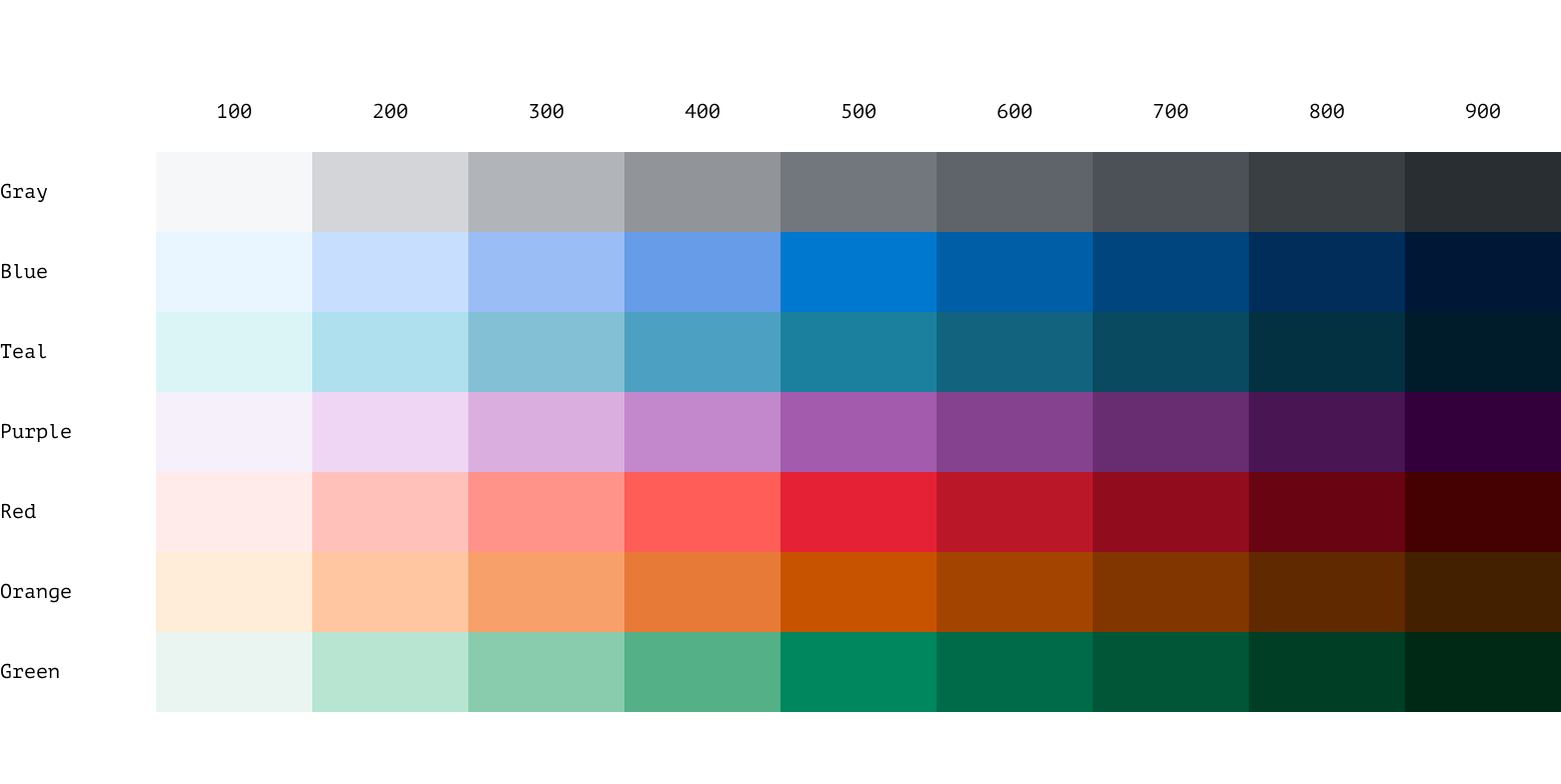
To address the many unused colors in the previous palette, the new color ramps have been reduced to nine swatches per ramp, with 500 as the shared middle value. We call this mode agnostic, meaning the color remains the same when switching between light and dark modes. The rest of the palette is based on 'equivalents,' where the ramp is inverted for dark mode—for example, blue-100 in light mode is equivalent to blue-900 in dark mode and vice versa.

The 500 series swatches have been carefully selected to ensure that primary text—white or black—achieves a minimum contrast ratio of 4.5:1 when placed on any of them. These swatches serve as the base color value for each ramp, with four lighter and four darker swatches on either side.

Primary, secondary, and tertiary backgrounds have been created as standalone swatches and are no longer tied to the color ramps. This includes snow, marble and limestone for light mode; and jet, granite and leather for dark mode.

In addition to the foundational ramp, a revamped categorical color palette has been added, expanding from 20 to 40 color options per mode. The first 20 colors are mode agnostic, following the same principle as the 500 series in the foundational palette, ensuring primary text (white or black) meets a minimum contrast ratio of 4.5:1 when placed on any of these colors.

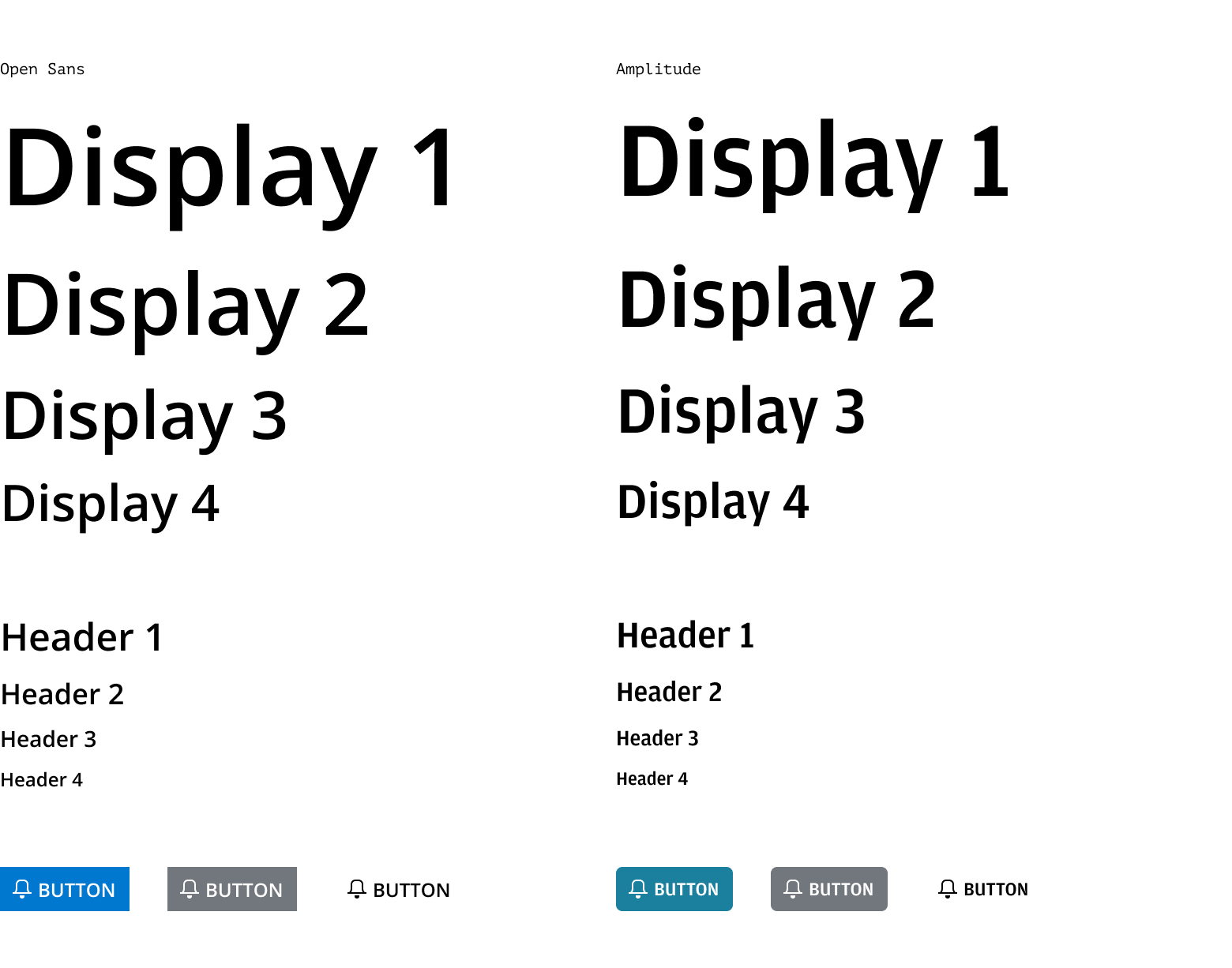
Salt Next introduces the Amplitude typeface, taken directly from the CIB Brand Guidelines, for use in header and display sizes as well as button labels. Open Sans remains the primary typeface for body copy text sizes and smaller in the Salt Next type ramps.
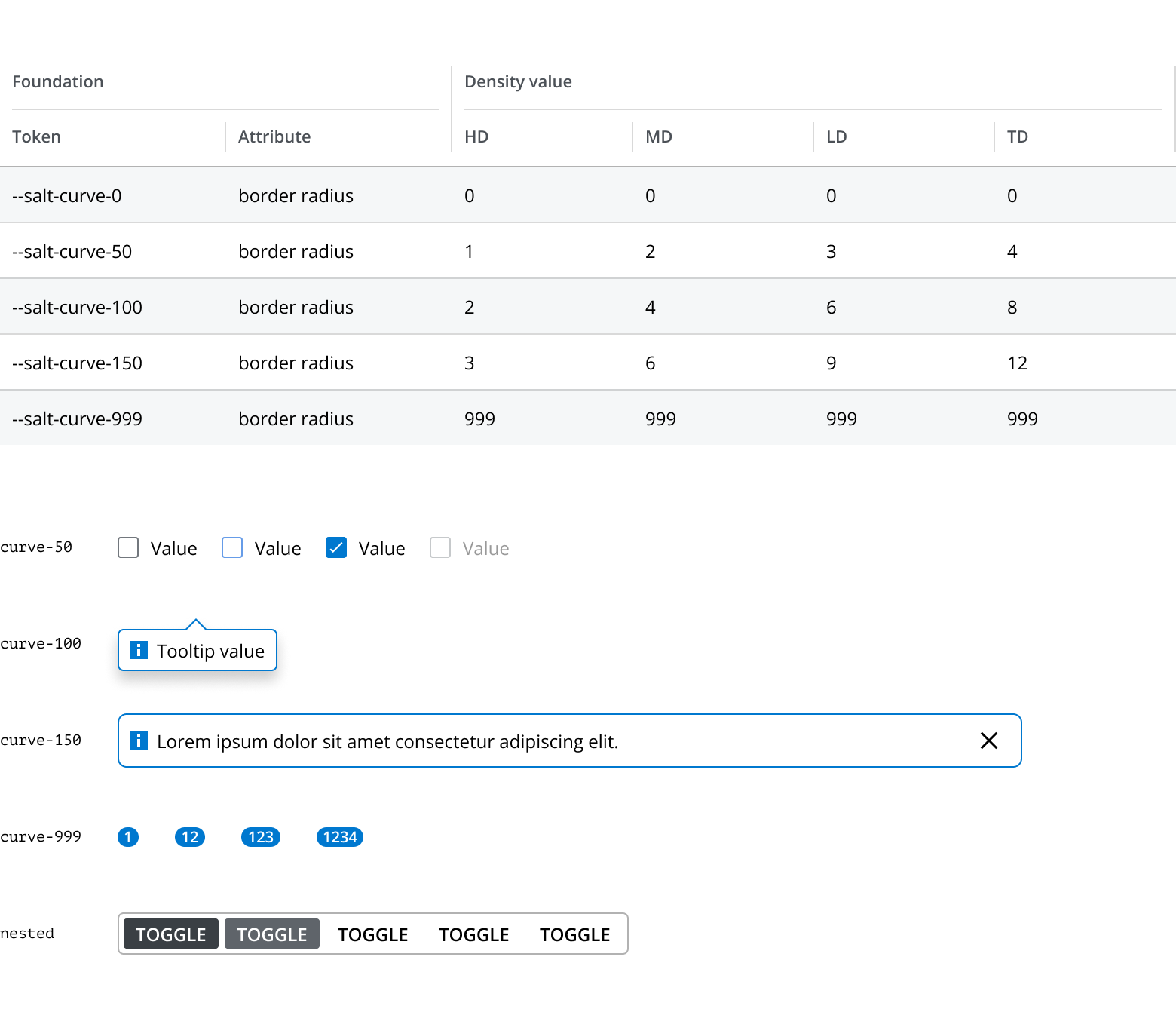
Salt Next includes the ability to apply predefined corner radiuses to specified components. This rounded corner feature, from the CIB Brand Guidelines, allows designers to create a softer, more consumer-friendly look-and-feel in their products. Each density includes four different radiuses, which help achieve a sense of visual nesting when used together.
Before using the Salt Next theme in design or development you should align with your Product team and check which theme to use, and when an appropriate time to switch themes is.
Due to the benefits of improved accessibility and brand alignment, and the ability to easily tailor look-and-feel to use cases, Salt recommends that delivery teams plan to switch to the Salt Next theme.
We understand the importance of the current theme for products migrating from UI Toolkit. We will continue to ensure the availability of the current theme for Salt components.
The current theme offers limited styling options except for density and mode. Customizing the look-and-feel of the current theme is not recommended. Please note that any customizations made to this theme are your responsibility to maintain.
If you are a designer, be aware that if your product team is continuing to use the current theme you need to continue using the Salt Light and Dark Component Figma libraries, and associated Figma libraries. In H2 2024 we will include current theme support in the new Salt Next variable-driven Figma library.
The Salt Next theme is now stable and available in both Figma and code to use in your production delivery.
To provide 'styling options' and theming capability the new Salt Next Figma libraries implement Salt design tokens as Figma variables to define all the visual attributes of components.
Using Figma variables enables us to reduce the number of Figma libraries we need to provide. Salt Next has the following libraries:
- Salt (Next) Components & Patterns
- Salt (Next) Style Library
- Salt (Next) Color Library
The 'Salt Icons' library has been updated with variable support to work with Salt Next components.
To access the libraries:
-
Go to the Assets panel in your Figma file.
-
Tap on the Libraries icon (open book icon).

-
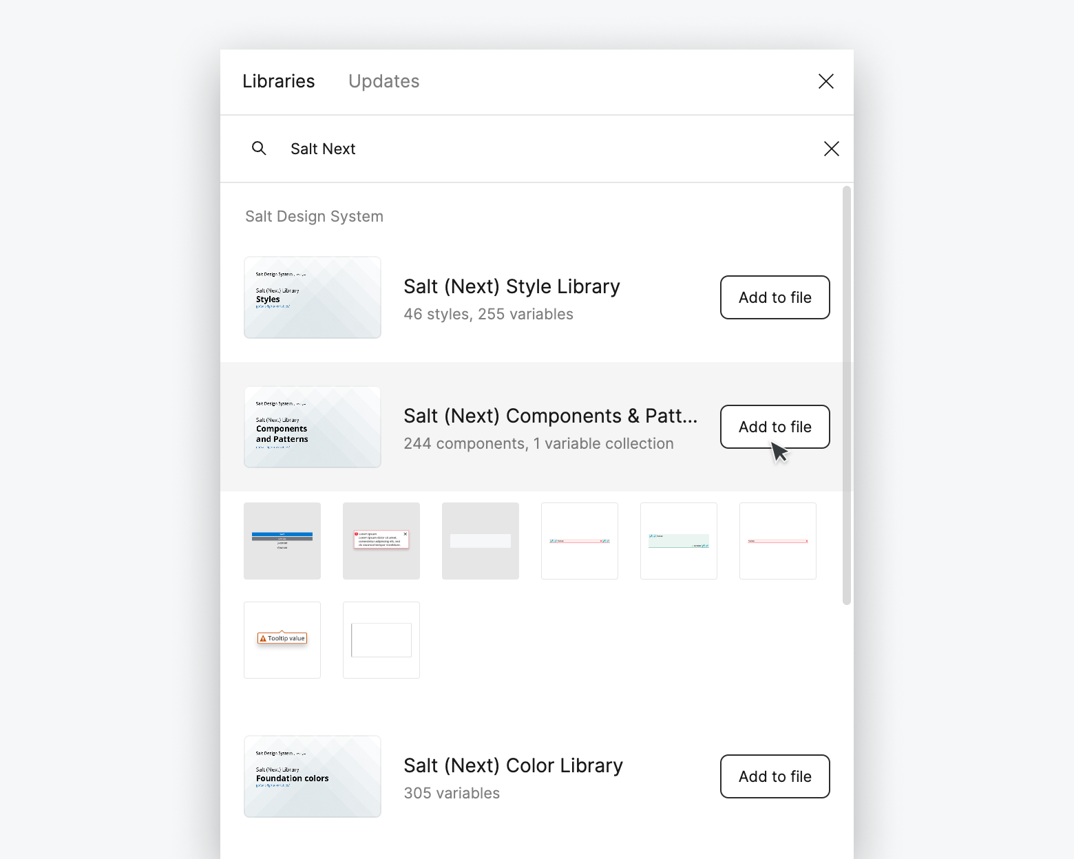
Search for 'Salt Next'.
-
Add the three available libraries (referenced above) to your file.
The style library includes all the Figma variables needed to design for Salt. It includes the semantic palette, category colors, size and spacing values, corner radiuses, typographic styles and more. Using Style Library variables to style your components automatically adds 'styling options' to your components.
The variables are set up to match our tokens in code. When inspecting a design in Figma's Dev Mode, you can see references that match our tokens, such as size and spacing values (e.g., --spacing-100 in Figma maps to --salt-spacing-100 in code).
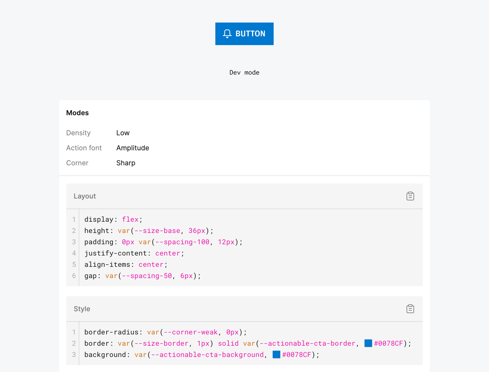
The colors library provides access to all foundational color ramps (e.g., --blue-100 to --blue-900). These colors are linked to the semantic styles in the Salt Next Styles library.
You don't need to add these colors to your project unless you want to use them directly. For consistency across components and to benefit from 'styling options', Salt recommends only applying variables from the Salt Next Style library to your project.
The new variable-driven component and pattern library functions similarly to the current Salt component library but with key differences:
- No need to switch between light and dark mode libraries.
- No need to set density at the component level.
- Access to new 'styling options' like round corners, accent color, and Amplitude as a heading and/or action font.
-
Add components: Drag from the Assets panel.
-
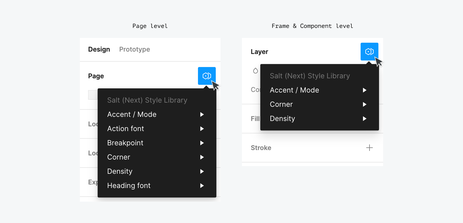
Access 'styling options': In the right sidebar, click 'Change variable mode' (double hexagon) icon in the Layer panel to see all available options.
-
For Pages, Groups, Sections, Frames or Components:
- Accent / Mode: Set teal or blue (default) accent color (e.g., indicators in Tabs, CTA buttons) in light or dark mode.
- Corner: Switch between sharp (default) and round corners.
- Density: Change the size, spacing, corner radius and type size of elements for high (default), medium, low or touch density.
- Heading Font: Set display and H1-H4 type styles as Open Sans or Amplitude.
- Action Font: Set action components (mostly Buttons) type styles as Open Sans or Amplitude.
While you can set styling options for individual components, we recommend setting the required options for a product / LOB design language at a Figma Page level. This ensures consistency and avoids setting variables component-by-component. Options can be adjusted further at a nested Frame or Component level where you need to mix styling options.
The new Salt Provider, SaltProviderNext, offers new styling options like rounded corners and balanced color palettes. It extends the existing Salt Provider, keeping current options (light / dark modes, density levels) with new props for new options.
To use it, replace the existing SaltProvider with SaltProviderNext and import the new theme CSS.
The new provider adds .salt-theme-next to the root or provider element, along with any needed data attributes (e.g., data-corner). All values in theme-next.css are scoped to .salt-theme-next to override any existing values.
You can apply styling options as corresponding props to SaltProviderNext –
When Amplitude is used, default heading font weight is set to medium (instead of semi bold for Open Sans), via --salt-palette-text-heading-fontWeight and --salt-palette-text-display-fontWeight variables.
To ensure that every user sees the Amplitude font correctly, you'll need to add it to your application, which can be downloaded from the fonts page on the internal site if you're part of JPMC.
Display text styles are updated to distinguish them from heading text (h1/h2/h3/h4). They are now larger than h1 across densities.
You can use an npm package to ensure consistency. For example, a team can encapsulate preferred presets, allowing product teams to use them without needing detailed knowledge of the options.